ProCalendar Heatmap
Calendar Heatmap Visual for Power BI
Understand when activity happens across days, months, years, fiscal quarters, and hours of the week. ProCalendar Heatmap turns date-based metrics into readable Power BI heatmaps with native tooltips, cross-filtering, legends, holidays, themes, and performance controls.
Calendar Modes
Annual, Month, Multi-Year, Fiscal Quarter, and Week x Hour in one visual.
Scale Control
Auto, current view, date range, all data, or manual min/max color domains.
Power BI Native
Tooltips, selection, drilldown, context menu, themes, and export support.
See ProCalendar Heatmap in Action
Click any image to enlarge.
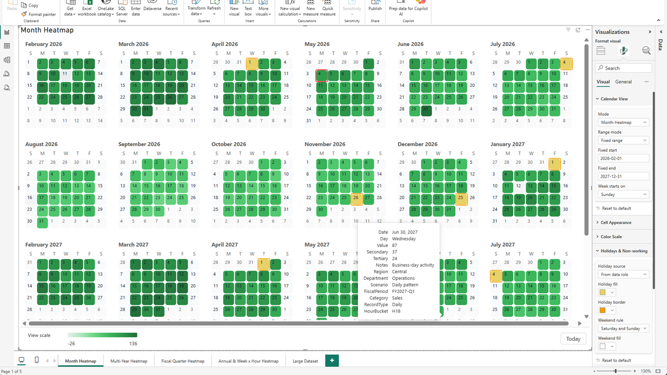
A calendar your report consumers already understand.
Month Heatmap shows day-level values in a familiar calendar layout. This view demonstrates fixed date range controls, holiday and weekend styling, highlighted special dates, a bottom legend, and a rich tooltip with Date, Day, Value, Secondary, Tertiary, Notes, Region, Department, Scenario, Fiscal Period, Category, Record Type, and Hour Bucket.
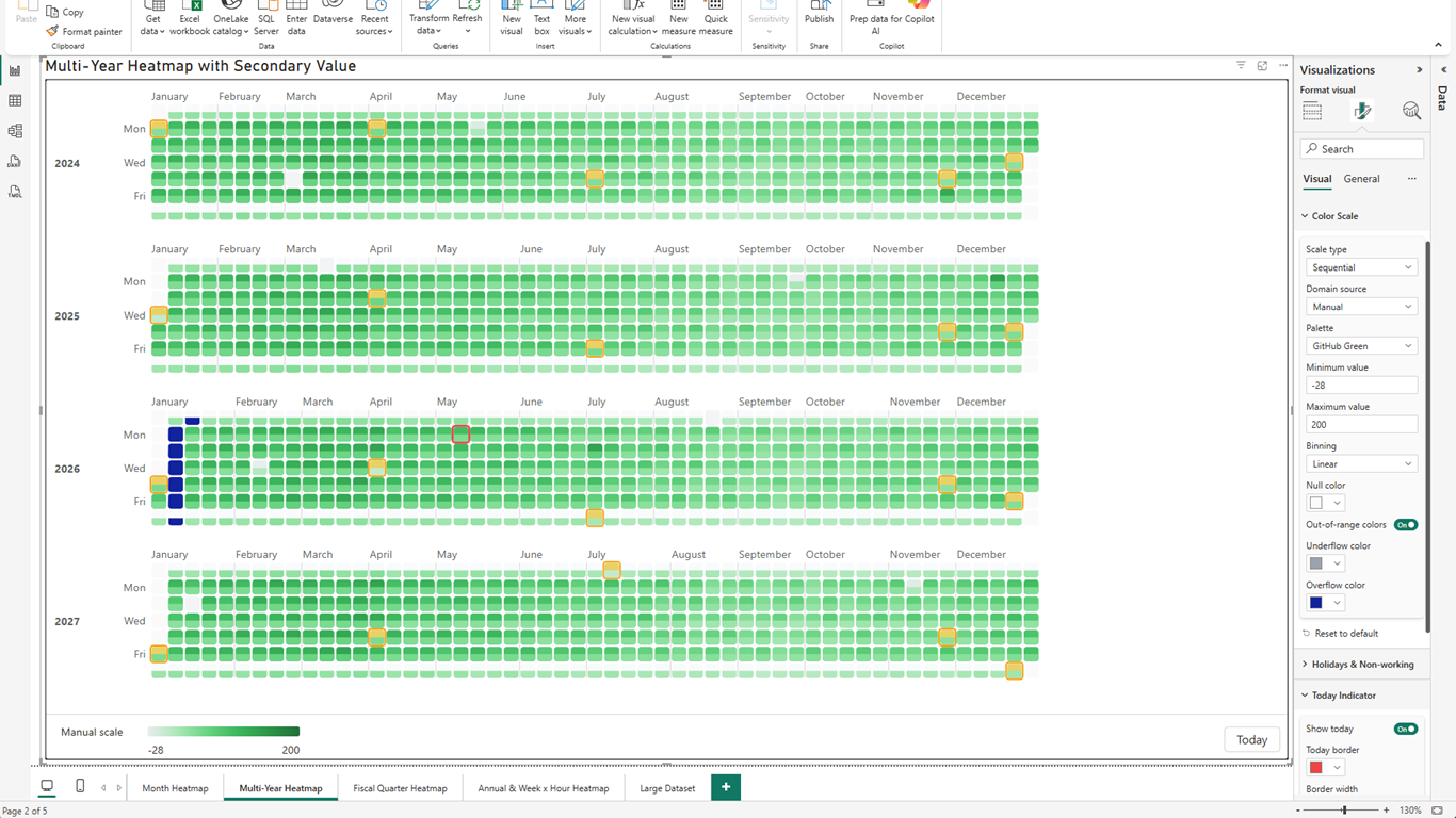
Compare years with a color scale you control.
Multi-Year Heatmap aligns 2024, 2025, 2026, and 2027 into stacked year bands. Manual domain source fixes the scale from -28 to 200, while out-of-range colors make values outside the chosen domain stand out immediately.
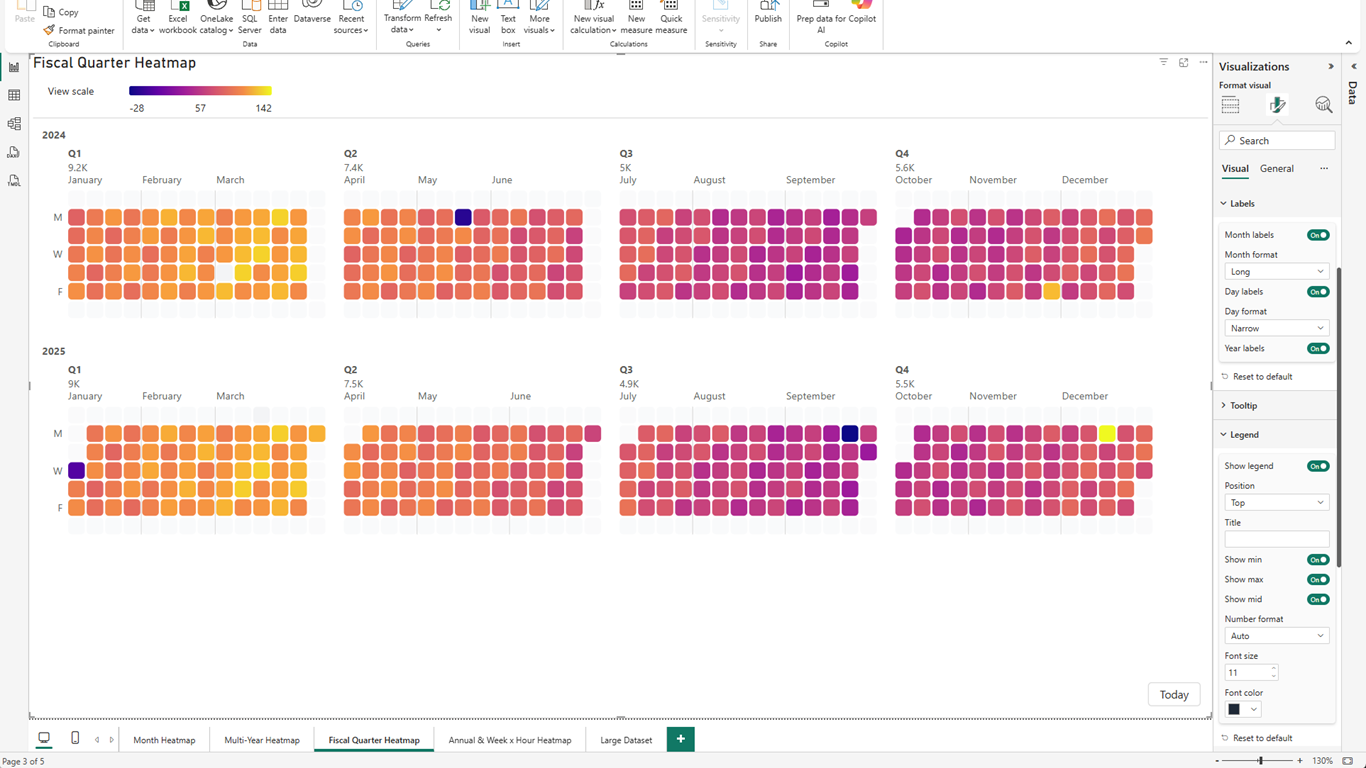
Daily detail, organized for quarterly reviews.
Fiscal Quarter Heatmap groups daily cells into Q1-Q4 panels with aggregate quarter totals. The screenshot shows a custom palette, month and day label formatting, year labels, and a top-positioned legend with min, max, and mid values.
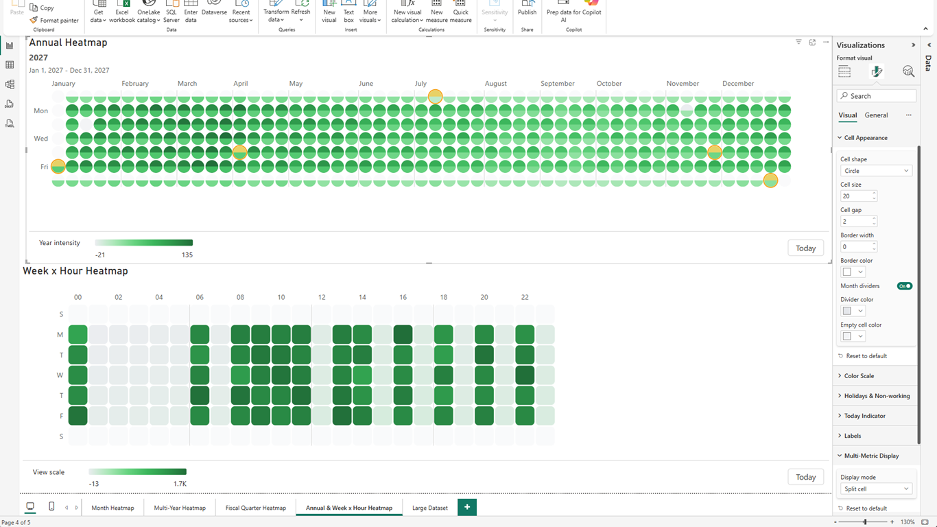
Annual seasonality and hour-of-week load on one page.
Two visuals show different analytical questions side by side. Annual Heatmap uses circle cells and split-cell multi-metric rendering. Week x Hour Heatmap below reveals recurring hourly patterns across weekdays. The Cell Appearance card controls shape, size, gaps, borders, dividers, and empty-cell color.
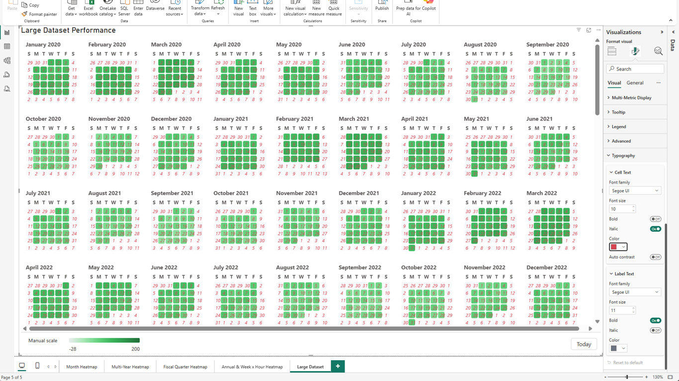
Large ranges stay readable, and typography stays yours.
A dense Month Heatmap renders many months from 2020 through 2022 with scrollbars and a manual scale legend. Typography settings demonstrate independent Cell Text and Label Text styling, including font size, bold, italic, color, and auto contrast.
Built for Date-Based Analytics
ProCalendar Heatmap is not an event scheduler. It is an analytical visual for finding patterns in date and DateTime metrics.
Five Heatmap Modes in One Power BI Visual
Switch between Annual Heatmap, Month Heatmap, Multi-Year Heatmap, Fiscal Quarter Heatmap, and Week x Hour Heatmap without rebuilding your report. Each mode keeps the same Power BI field bindings and formatting workflow.
Month Heatmap for Familiar Calendar Reporting
Use a traditional month-grid layout with day numbers, weekday headers, fixed ranges, weekends, holidays, tooltips, and a legend. It reads like a calendar, but behaves like an analytical heatmap.
Annual Focus for One-Year Pattern Discovery
Annual Heatmap gives a high-resolution single-year view with selected-year controls, title and date-range subtitle, month labels, weekday labels, and a color domain optimized for the visible year.
Multi-Year Comparison With Stable Scale Controls
Compare several years as aligned heatmap bands. Use automatic mode-aware domains, date-range domains, all-data domains, or manual min/max values when you need colors to stay stable across reports.
Fiscal Quarter Heatmap for Review Cadence
Quarter panels keep daily heatmap detail while rolling the layout into Q1-Q4 sections. Fiscal-year start month, month labels, day labels, aggregate headers, and top legends make it fit quarterly business reviews.
Week x Hour Heatmap for Operational Load
DateTime rows can be aggregated into a 7 by 24 heatmap to show when activity happens during the week. Use sum, average, min, max, or count, with 12-hour or 24-hour labels.
Advanced Color Scales and Threshold Rules
Use sequential, diverging, or threshold-rule scales. Choose built-in palettes, custom colors, out-of-range colors, null colors, logarithmic binning, and manual min/max control.
Holidays, Weekends, Today, and Rich Tooltips
Mark holidays from a data field or JSON list, highlight weekends, outline today, and surface all Power BI tooltip fields including secondary and tertiary metrics.
Multi-Metric Display and Typography Control
Show secondary metrics through split cells or composite color, then tune cell text and label text independently with font, size, style, color, and auto-contrast controls.
Heatmap Modes
Each mode answers a different calendar analytics question.
| Mode | Best for | Color scale default |
|---|---|---|
| Annual Heatmap | Single-year focus and seasonality | Visible selected year |
| Month Heatmap | Familiar calendar panels and daily inspection | Current view |
| Multi-Year Heatmap | Year-over-year comparison | Date range for comparability |
| Fiscal Quarter Heatmap | Q1-Q4 business reviews | Current view |
| Week x Hour Heatmap | Operational hour-of-week load | Current view |
Common Use Cases
Any metric with a date can become a pattern map: activity, demand, utilization, revenue, attendance, incidents, or load.
Daily Sales and Activity Heatmaps
Spot streaks, gaps, seasonality, high-volume periods, and quiet days across months or years.
Operations and Support Load
Use Week x Hour Heatmap to find recurring staffing peaks, support-ticket surges, or service load windows.
Holiday and Weekend Impact
Compare normal days against holidays, weekends, closures, promotions, and other special-date effects.
Year-over-Year Seasonality
Use Multi-Year Heatmap to compare annual cycles with a stable color domain across all visible years.
Fiscal Quarter Reviews
Show daily behavior inside Q1-Q4 panels that follow your organization's fiscal calendar.
Large Calendar Dashboards
Render long date ranges with performance controls, scrollable layouts, legends, and readable typography.
Pricing
Free covers the most common daily heatmap use cases. Pro unlocks the advanced modes and extended formatting surface.
Free
$0
Always free, no trial required
- Annual Heatmap and Month Heatmap
- Single value field
- Core palettes and legends
- Tooltips, cross-filtering, context menu
- Today indicator
- Up to 366 visible days
- Watermark in Power BI Service
Pro
$0.99
per user / month
$9.99 / user / year
Everything in Free, plus:
- Multi-Year, Fiscal Quarter, and Week x Hour modes
- Unlimited date range
- Fiscal calendar controls
- Holiday and weekend styling
- Threshold rules and Pro palettes
- Manual color domains and out-of-range colors
- Multi-metric split-cell and composite display
- Canvas performance controls
- No watermark in Power BI Service
Free 30-day trial included
No external service calls. Runs entirely inside Power BI.