ProSankey
Sankey & Flow Diagram for Power BI
Power BI has no built-in Sankey chart. Most third-party Sankeyvisuals crash on circular data and hide values inside tooltips. ProSankey is built differently — zero data prep for path flows, loop-safe layout for every graph, and click-to-trace interaction that turns a dense diagram into a clear answer.
Path Mode
Drop N columns as Levels. ProSankey draws the rest. No source-target prep needed.
Graph Mode
Bind Source + Target + Value for any directed flow graph — cycles included.
Temporal Graph Pro
Add a Time column. ProSankey unfolds the network across periods — loops become forward arcs.
See What It Can Do
Click any image to enlarge.
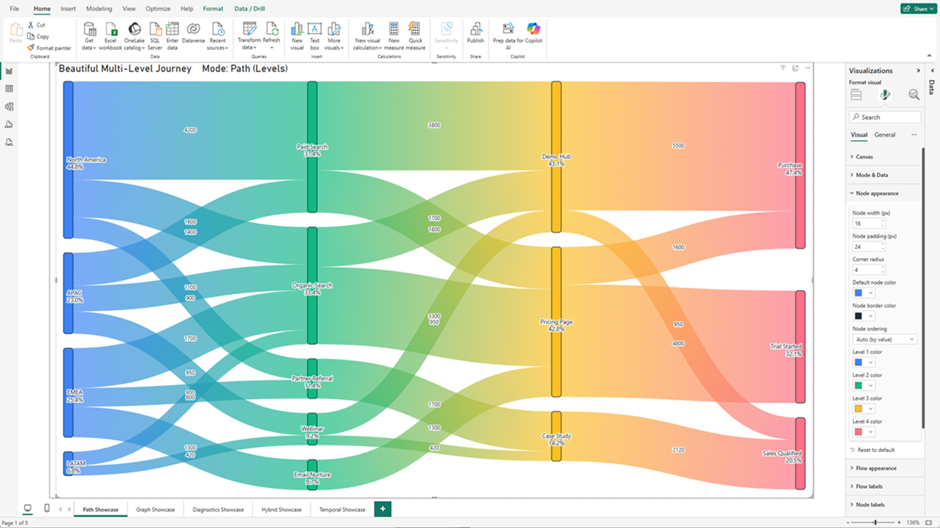
Four columns. Zero prep. This.
Four categorical columns dragged straight from a flat table into the Levels well. No source-target reshaping. No Power Query. ProSankey sizes each flow by value, colors each level, and labels every node with name and percentage. The Format panel on the right is all it takes to change anything.
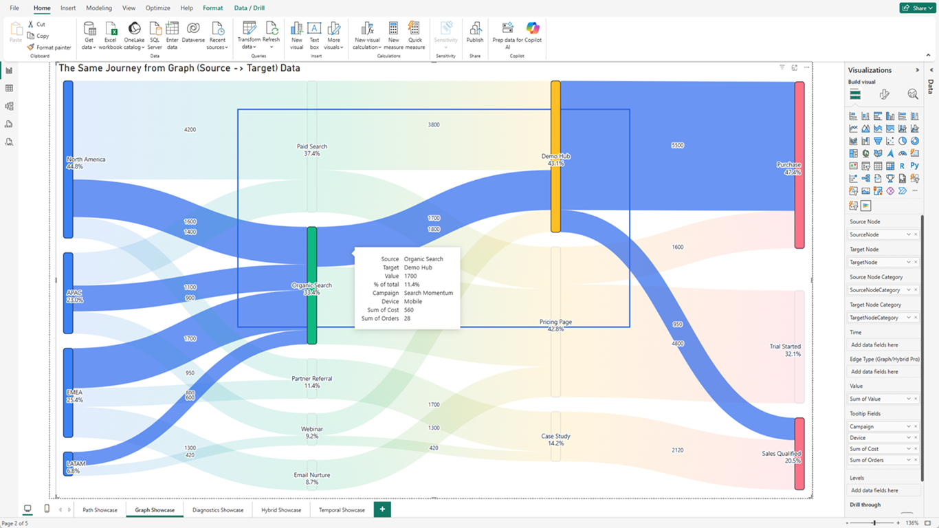
Click a flow. See the whole story.
One click on any flow band and the entire connected path lights up — everything else fades. The tooltip surfaces whatever fields the analyst bound: text, numeric, aggregated. A busy diagram becomes a single clear answer without leaving the report.
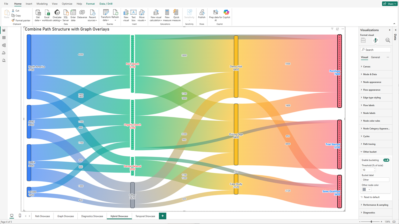
Real data is messy. ProSankey handles it.
Hybrid mode combines path-style levels and graph-style edges in one diagram. Bucketing collapses the low-volume tail into a single "Other" node automatically — threshold and label are one setting. Node Category Appearance gives each business domain its own fill pattern and color. This is what a production Sankey looks like.
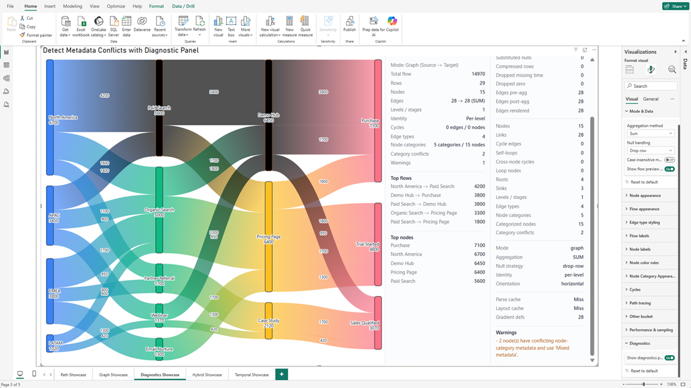
Something is wrong with your data. ProSankey finds it first.
The Flow Preview panel summarizes the diagram state in real time. The Diagnostics panel surfaces warnings with exact descriptions. The two nodes with conflicting metadata are already rendered black in the diagram — you see the problem before you read the panel. Data issues get caught in development, not in the board meeting.
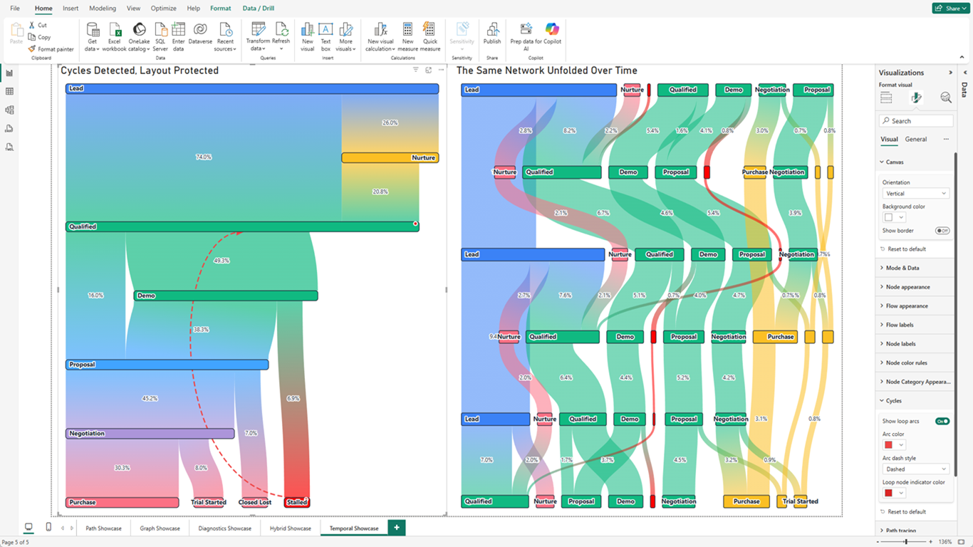
Your data has loops. Other tools crash. ProSankey has two answers.
Two visuals, one dataset, two strategies. Left: ProSankey detects every back-edge and renders it as a styled arc above the layout — the diagram stays stable, no crash. Right: the same data with a Time column added. Temporal Graph mode repeats node instances per period and connects them forward, so the loop dissolves entirely. One field changes everything.
Built for Analysts, Not for Demos
Every feature in ProSankey exists because a real analysis task required it.
Zero Data Prep — Just Drop Columns
In Path mode, drag any categorical columns into Levels and ProSankey draws the entire flow automatically. No reshaping into source-target pairs. No Power Query gymnastics. Your data is already ready.
The Only Loop-Safe Sankey for Power BI
Every other Sankey visual crashes or distorts when your data has circular flows — sales stages that loop back, tickets that reopen, processes that revisit earlier steps. ProSankey detects cycles automatically and renders them as clean back-arcs. The layout stays intact.
Click Any Flow. Trace the Whole Path.
Click a flow band and the entire connected upstream-to-downstream path lights up at full opacity. Everything else fades away. In dense diagrams with dozens of crossing flows, this turns a visual puzzle into an instant answer.
Three Input Modes — One Visual Fits All
Path mode for multi-column journeys (Region → Channel → Page → Outcome). Graph mode for explicit source-target edge lists. Hybrid mode (Pro) when you need both in one diagram. The mode is detected automatically from what you bind.
Flow Labels That Actually Show Up
Values and percentages sit directly on the flow bands — not buried in tooltips. Placement, font, size, color, and a halo for readability are all configurable. Narrow flows hide their labels automatically so the chart never looks cluttered.
Auto-Bucket Long Tails into "Other"
Real data has 40 acquisition channels and 3 meaningful ones. Set a percentage threshold and ProSankey collapses everything below it into a single "Other" node. Click "Other" to expand it back inline. The diagram stays readable; the detail is still there.
Style Flows by Business Category
Bind an Edge Type column and assign distinct colors, dash patterns, and opacities to each flow category — paid vs. organic, hot vs. cold, inbound vs. outbound. Eight styling rules. Bucketing preserves edge type, so styles hold even after "Other" appears.
Temporal Graph: Unfold Loops Into Time
Add a Time column in Graph mode and ProSankey repeats node instances per period, connecting them with carry-forward links. A deal bouncing between Demo and Nurture stops looking like a loop and starts looking like a forward arc across time. Cycles dissolve.
Diagnostics That Catch Problems Before Stakeholders Do
Two built-in panels surface live topology stats, data warnings, and category conflicts. When a node has conflicting metadata, it turns black in the diagram immediately. You find the problem in development — not in the board meeting.
Who Uses ProSankey
Financial analysts, growth and product analysts, operations teams, and BI developers who need to put a flow diagram inside a Power BI report — and have it actually work on real data.
Customer Journey & Conversion Funnels
Drop region, channel, page, and outcome columns straight into Levels. See where users enter, where they drop off, and which paths drive conversion — without touching Power Query.
Revenue Attribution
Trace how revenue flows from acquisition channels through product lines to business units. Use Edge Type styling to distinguish paid from organic, and bucketing to collapse the long tail.
Sales Pipeline & Deal Flow
Graph mode handles the irregular topology of a real sales funnel — deals skip stages, regress, and stall. Loop detection keeps the layout intact. Temporal Graph unfolds revisits across quarters.
Supply Chain & Logistics
Map material flow from suppliers through manufacturing, warehousing, and distribution. Flow labels show volume on each band. Path tracing isolates any single route in one click.
Budget & Cost Allocation
Show how budget flows from cost centers through projects to outputs. Bucketing collapses minor line items. Node Category Appearance distinguishes CapEx from OpEx without extra columns.
HR & Workforce Movement
Map role transitions, promotions, and attrition flows across departments over time. Temporal Graph turns annual snapshots into a continuous movement view. Cycles reveal roles people keep returning to.
Pricing
Free is fully functional in Power BI Desktop. Pro unlocks the advanced analysis features in Power BI Service.
Free
$0
Always free, no trial required
- Path mode — up to 3 levels
- Graph mode — any topology
- Loop-safe layout (cycle detection runs on all tiers)
- Color rules for nodes
- Cross-filtering, bookmarks, tooltips
- Dark theme & high-contrast mode
- Flow Preview & Diagnostics panels (selected fields)
- Up to 30,000 rows
Pro
$2.99
per user / month
$29.99 / user / year
Everything in Free, plus:
- Path mode up to 16 levels
- Hybrid mode (Path + Graph combined)
- Temporal Graph — unfold networks across time
- Click-to-trace path highlighting
- Cycle arcs — render loops as styled back-arcs
- Flow labels on bands (value or %)
- Node labels (name, value, percent)
- Auto-bucket "Other" for long-tail nodes
- Edge Type styling — color flows by category
- Node Category Appearance — style node groups
- Vertical orientation
- Advanced aggregation (Count, Avg, Min, Max)
- Full Diagnostics panel values
- No watermark in Power BI Service
Free 30-day trial included
Microsoft-certified. No external service calls. Safe for organization-wide deployment.